Our kitchen has been coming along beautifully – most of the work was finished in the first week.
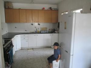
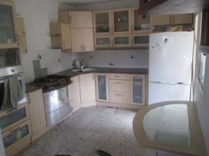
To recap, here’s the kitchen before:
Below, the top cabinets have all been taken out, and the first new cabinets going up.
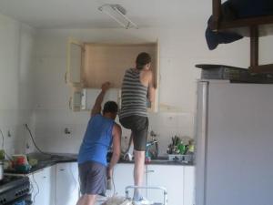
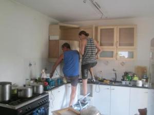
There were a number of features I liked about our new cabinets, but a couple I really disliked. One was that the cabinets were all hung at staggered heights in the original kitchen. I had them all rehung to be at the same height since I find that more visually appealing.
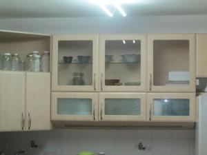
The next thing was the amount of display cabinets. I’m not really a display kind of person, and certainly not in the kitchen. I want it to be functional and look neat. I thought the large open display cabinet to the left and the clear glass cabinet doors on the right made the kitchen look too busy.
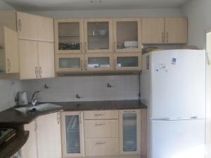
After the entire kitchen was installed, I looked around at the pieces left over. In order to make room for the built in oven – the original kitchen seemed to have had just a microwave or toaster – I asked them to take off a door in the standing unit and then move the shelving to fit it. When I looked at the now unneeded door, it occurred to me that it might be the right size for the non-standard sized open shelf. I held it up, and voila! A perfect fit! Really amazing since this is the only door in the entire kitchen that would have fit, and when I had it taken off I didn’t have it in mind to use it at all. In order to install it, I had to order special hinges that open wider than 90 degrees since it’s a corner cabinet, but the guys who put the kitchen in bought them for me at their supply place so it was cheaper than if I had bought them retail, and installed the door when they came with the hinges. (Then we used the original hinges from that door to replace a set of hinges over the sink that were rusty.) You can see the now closed cabinet it in the picture below.
As far as the clear glass display doors, I’m planning to take them into a glass place downtown and have them replaced with frosted glass to match the other doors. First I want to see if I can find the right shade of contact paper, since that will be a cheaper and easier solution. Though I don’t love how it looks right now, it’s not urgent so whenever I get around to this I’ll do it.
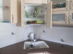
The original kitchen had the sink installed in the corner, a feature that I thought was fantastic since the corner tends to be mostly dead space. While it was an excellent use of space, this meant an extra cost for new plumbing, so I went back and forth about if this was worth it. I decided if we were going to make the investment in having all a new kitchen installed, then it was foolish not to spend a bit more when it would make the kitchen so much more usable.
It totally was worth every penny! I really like how functional the set up is now. Not only that, the cabinet above the sink has a built in drying rack for dishes, so it’s easy to wash dishes and keep things looking neat. I just shut the cabinet door and let things drip dry; the counter stays neat and no one’s the wiser. 🙂 Before I had a drying rack on the counter and no matter how clean the kitchen was, the counter always looked cluttered with clean dishes stacked up.
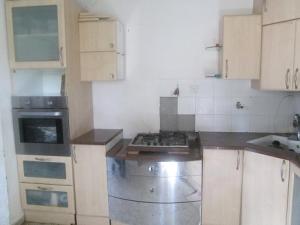
The area below is the one that has delayed my posting! Between the built in oven on the left and the burners on the right, there’s a cabinet. When the kitchen was originally installed, there was nothing. To me it looked unfinished and I deliberated about what to do about this. Since we have to retile the backsplash – you can see the tiles that were torn off below when the old countertop was removed – I was thinking about tiling all the way down to the ground, then hanging a towel rack against one of the cabinets. The advantage of doing this was it was a cheap solution and it would have looked fine.
However, I had another idea that I thought would look better, though it was more work and an additional cost. We had one bottom cabinet left over because we didn’t have enough space to put it in, and I thought that perhaps it could be cut down to fit the remaining space. This would also mean an additional cost of having the remaining piece of granite countertop cut down to fit, and I was reluctant to spend more money than I already had. However, not to do it would be pennywise and pound foolish – again, it would be a shame to spend so much to have the kitchen done, and then for a relatively small sum not finish it off. I had already paid the crew and the job was officially finished, so it wasn’t fair to call them back to do more work, even though in our original agreement we had included that they would cut down one top cabinet and one bottom cabinet (which they didn’t end up doing) so technically I wasn’t asking for anything beyond what we had agreed upon.
I asked a neighbor who is a carpenter if he thought the cabinet door would look right if it was cut down, and in response, he took apart the cabinet and told me he’d resize the entire thing for us (I was planning to cut down the cabinet ourselves to save on costs and just have a professional cut the door). After he finished the job he told me he wasn’t going to charge me anything! Not only that, he has a friend who cuts countertops, and he had his friend cut the piece for us as a favor to him (he said he’s done a lot of favors for this person), so my concern about the added cost ended up being a non-issue! This made the kitchen look more finished, gives us more cabinet space and it’s a perfect place to put hot pans when they come out of the oven!
When we retile, I’d like to create some kind of subtle framed design between the above top cabinets, and also plan to add a matching length of wood as a sort of bridge between these two so that there will be a better visual flow. Right now it’s a bit choppy and disconnected. I might wait until my husband comes back to do this part of the project. I didn’t want to leave any work for him but he said that we did all the hard work and he’d be happy to do the tiling. 🙂
I miss the ease of hopping in the van, driving to Home Depot, buying the tiles, supplies and any tools needed for the job in one place, and coming home. Now I have to go to one store for tiles, another for supplies (without a car) and find someone who can cut the tiles for me (since there’s nowhere to rent a wet saw and I’m not going to buy one for just this project), which means premeasuring and prefitting them all and then keeping track of what’s what. It makes a not so complicated tiling project more involved than I feel like dealing with right now. Another reason that I’m lagging a bit on this is that the design consultant at the tile store was very abrupt and told me that it’s a terrible idea to have any kind of design in the tiling; she was very impatient and I don’t think she understood what I was describing so I’m not sure how much weight to give her opinion. I also don’t really like the tiles that are popular now. They’ll probably look great but it’s not what I was picturing and it’s hard for me to figure out how to make a design out of them. So I haven’t decided about this.
Due to the color of the granite countertops (dark reddish streaked with grey) and the frosted glass doors, there’s already a lot going on visually so I have to do something very simple and understated for the tiles. It could be I’ll have to forget about any kind of design. That would definitely make for a straightforward tiling job. But doesn’t it seem like a picture or some kind of visual accent would add a nice touch? The original kitchen had a stainless steel thing that looked like a round chimney for a venting fan above this area, but when we put it up it didn’t look as nice as I expected (it had two glass shelves on it that we couldn’t hang since we moved everything around, so that also detracted from the look of it), so we took it down. I don’t need a fan there, so the only reason we put it up was to fill the space. (If you have ideas or thoughts on this, please share them – I’m open to suggestions!)
Here’s a picture of the almost finished kitchen – in the foreground you can see the matching kitchen table. It’s nice to have another surface to eat or work on, which will be particularly nice when we’re homeschooling but helpful at any time. With the fridge moved to the place where it is now, it feels bigger and more light in the kitchen than it did before.
Below is a picture in the evening. I appreciate the built-in lights below the upper cabinets so I don’t have to keep on the bright ceiling lights at night; it’s a softer feeling that matches the quieter evening mood in the house.
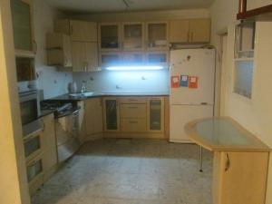
Although the kitchen isn’t yet fully finished, I’m so happy with it! The countertops are slightly higher than my old kitchen, which is nice for a tall family like us. The sink is deeper and wider. The top cabinets are slightly deeper and taller than the old ones so they’re more spacious, and bottom cabinets are all drawers. I love drawers for the way they maximize space and make it easier to keep things well -organized. There’s so much more storage space than I had before! Two bottom cabinets are still empty in addition to the display top cabinets mostly being empty. It’s a nice thing to have more space than what I need. The space is well designed and it’s a pleasure to work in the kitchen; everything is just a step or two away and it’s easy to find what I need. I was concerned about losing counter space but there’s actually more usable space.
I’ve heard the sayings that I’m sure that you’ve all heard, that when you get a quote for home improvement work, double the cost and double the time they say it will take, and it will be close to on target. I had a good bit of anxiety about this, particularly when they pulled out the cabinets and discovered that the way the plumbing was would necessitate changes. I was concerned they were going to tell me that they hadn’t bargained on this and it’s more work than we agreed on, so they need to charge more. I did several relaxation and visualization exercises before I went to sleep the night this happened to release the tension I was feeling and kept picturing everything going smoothly. Everyone was feeling tension about this situation because it had potential to get complicated and the solution that was worked out required flexibility on all of our parts but was something we were all happy with it. The crew we worked with was a pleasure to deal with, and I called the head a couple of days after they finished the job to thank them again and told them they’re welcome to use my name and number as a reference. It’s so nice to work with people with a good work ethic who honor their word.
Avivah
Can I ask why you didn’t install a second sink? I find that it saves me so much counter space, since I don’t have to have dairy dishes waiting on the counter until I wash the meat, etc.
By the way, the new kitchen is beautiful.
I wish I could find something new for myself as well- I have a nice sized kitchen but very poorly designed.
Thanks, Kaila! I considered putting in a second sink but decided against it for a few reasons: 1) additional cost (I’d have had to not only buy a second sink – over 1000 shekels – and had the countertop sent to the factory to be specially cut which in addition to the cutting fee (minimum 500 shekels) would have required yet another expense in hiring three men to take it there and bring it back); 2) lost counter space, and the reason neither the cost nor counter space were justified – 3) we don’t eat much dairy and plan to move towards being dairy free.
If I could have put in a double sink for no cost, I would have done it but otherwise wouldn’t have wanted a totally separate sink in a different part of the kitchen, because it wouldn’t leave me much usable counter space.
How nice it looks! I think if you keep looking you will eventually find a tile solution that you really like. I so appreciate your artistic eye! If you are still coming into Jerusalem you might want to look up a few places there to check out tile options. Also I have seen people continue the marble counter top right up the wall as a back splash. Or… if you really want to get creative- you could make your own design using mosaic tiles.
As far as having an extra sink like Kaila asked about- everyone in our neighborhood have 2 sinks in the kitchen. I feel that it really lowers our children’s understanding of practical halacha. I realized this when one of my children was shocked that it was possible to have a kosher kitchen with only one sink.
It’s the same argument about having an eruv for Shabbos. Practically speaking, it makes life easier.
It’s beautiful, Avivah! I love the colors!
So fine so creative. Much love
Beautiful!! Rustoleum makes a spray paint that “frosts” glass. That might be an alternative for the cabinet doors. 🙂
What a great idea! I’ll have to ask at the local hardware stores and find out if they sell something like that. Oh, how I miss Home Depot…
I popped down to the comments to suggest the same thing. There is an older-style product that google says is called “glass etching cream” from the brand Armour Etch that might work too. It was very popular a while back to make plain glass doors look prettier with decorative stencils.
I love it!! May you enjoy many years of delicious meals and family togetherness in this new space! My MIL recently re-did her kitchen and used plain small subway tiles with a beveled edge (pretty cheap) for the backsplash with a large rectangular focal point of small square glass tiles. I think the glass tiles come pre-mounted in 1X1′ squares, so they probably used two large squares on top of each other. She also did a thin strip of the glass tiles around the whole kitchen to tie the space together. The glass tiles catch light and look sparkly in the sun as a bonus also come in many color schemes. They would also go well with your frosted or plain glass front cabinets. Good luck! I’m sure whatever you come up with will be beautiful!
That sounds stunning, Talya, thanks so much for sharing! (If you have a picture I’d love it if you can email it to me!) It fits right in with the general idea of what I’d like to do – I’ll have to check at the tile store if they have small subway tiles; when I was there last time I only noticed very large rectangular tiles but I didn’t ask specifically about small ones.
I’m sorry, I don’t have a picture…we live about 6 hours away from them. If you have a chance, look up “This Old House.” The magazine has a website with a lot of sample projects that use subway tile so you can get more ideas. They also have how-to’s but you probably don’t need that. The whole idea is people remodeling their homes with period -appropriate decor. Back in the 1900 and on subway tiles were used a lot because they were cheap and abundant and there weren’t so many tile choices. So many projects submitted to TOH people come up with ideas to use them but not make the space look like well, a subway station.
Titchadshu on the new kitchen!
Thank you for all the info- it is very helpful.
Can you talk about why you want to be dairy free?
thank you
i love the new kitchen. You will find that the softer light that you use in the evening is great for task lighting when necessary. We have one over our sink and we use it on Shabbos/Yom Tov, when we don’t want to have the big kitchen light on but we do need some lighting for the evening meals and clean up. Enjoy!
Wow! The kitchen looks great!!
I love it! The dish drainer cupboard is so clever!
For the frosted glass, there’s a product they sell in craft stores for doing glass etching. I wonder if that would work? Might be very expensive for such a large area, and it might be a chemical you need to be careful with for health and safety warnings.
Another idea – is there some way to put little curtains on the inside?
A nice way to deal with glass-front cabinets is to tack up fabric inside with the “right” side facing out. It could be a good, cheap temporary solution.
I hadn’t thought of that, Shoshana and npl, thanks for the idea! That could be very doable.
This kitchen is beautiful! I love the sink in the corner, really looks well designed. I also love the matching table with the attached bit of cabinet.
And I think making your own mosaic is a great idea.
I love what you did in the kitchen! We may be replacing the cabinets and remodeling the kitchen in the house we’re moving into and this gives me ideas. The current kitchen does not make good use of cabinet space.
BEAUTIFUL 🙂
This is lovely. 🙂
I recently contacted you, Avivah, on a large family forum. I am very excited to read your blog, it’s such an encouragement to me.
Thank you!
Welcome, Rebecca! I’m so glad you introduced yourself and that you’re here! I hope you received my (delayed)response to your contact question.
May your kitchen be filled with much b’rachas, joy and good food!